Giving juice back its juice.
Juice Burst had a problem.
People knew the drink. They drank it. But they didn’t know the brand.
And if Juice Burst wanted to go from being just another juice drink to shaking up the drinks aisle, that had to change.
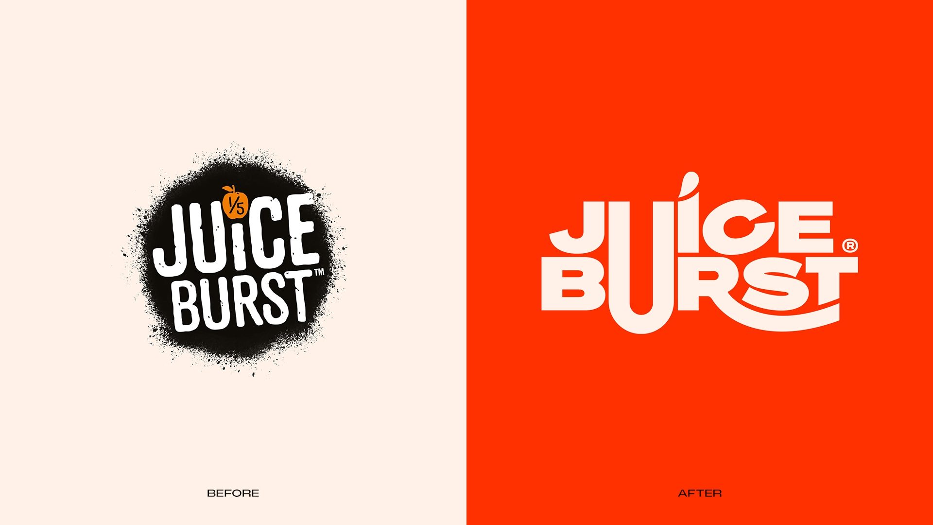
So, as part of a wider relaunch, Juice Burst came to us to give the brand something it had been missing: an identity people could recognise, remember and choose.
One with enough personality to burst off the shelf.
The only problem? We had just six months.
Squeezing more out of the brand
Before we got anywhere near the packaging, we had to work out what Juice Burst really stood for.
We created a clear creative platform for the brand, then explored different visual territories to find an identity it could truly own.
Consumer testing helped us separate the juicy ideas from the pith.
Then came the squeeze.
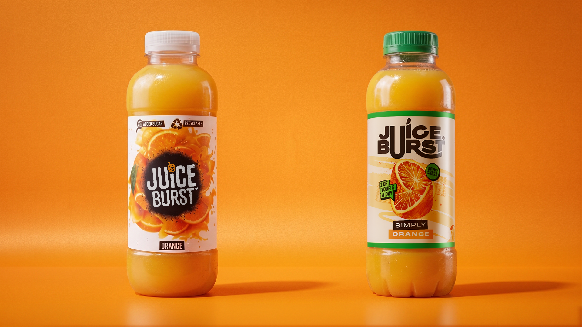
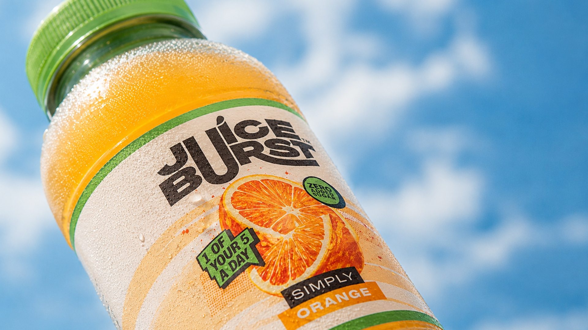
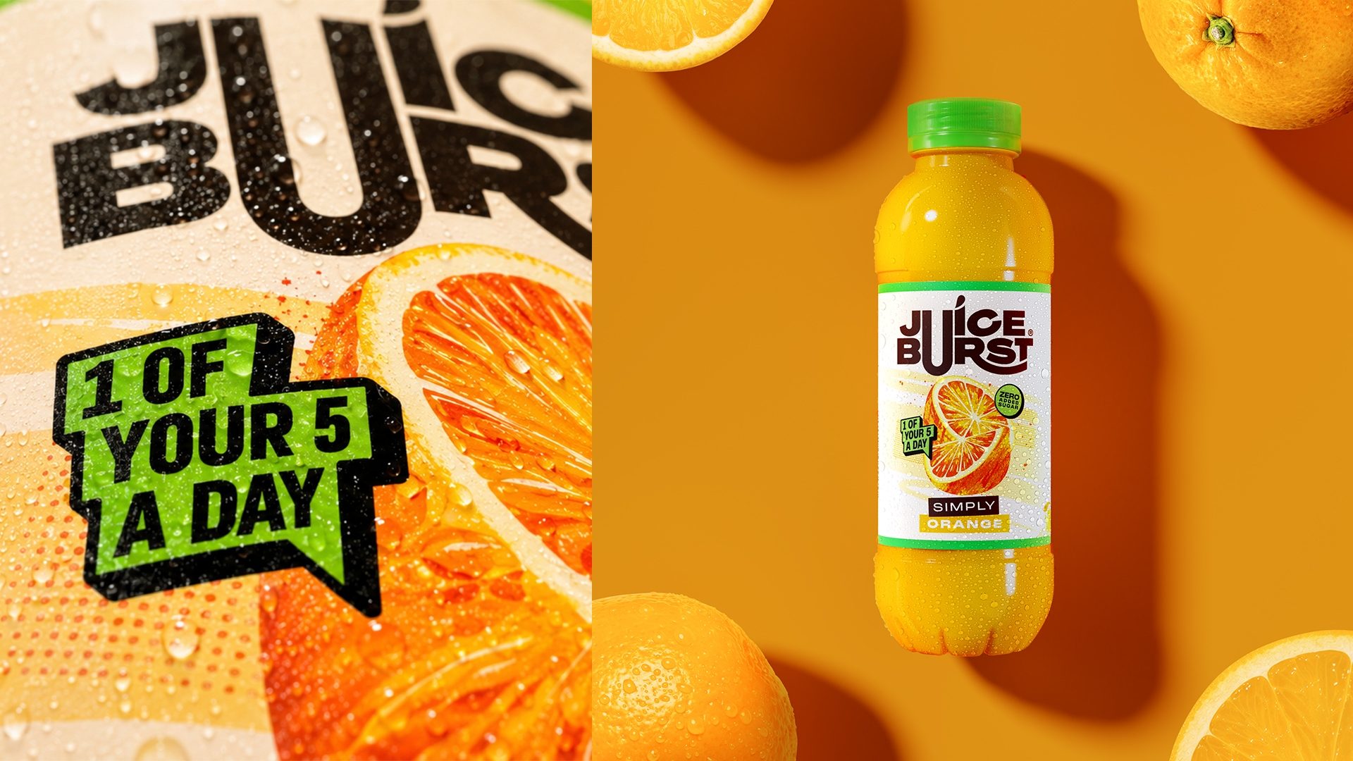
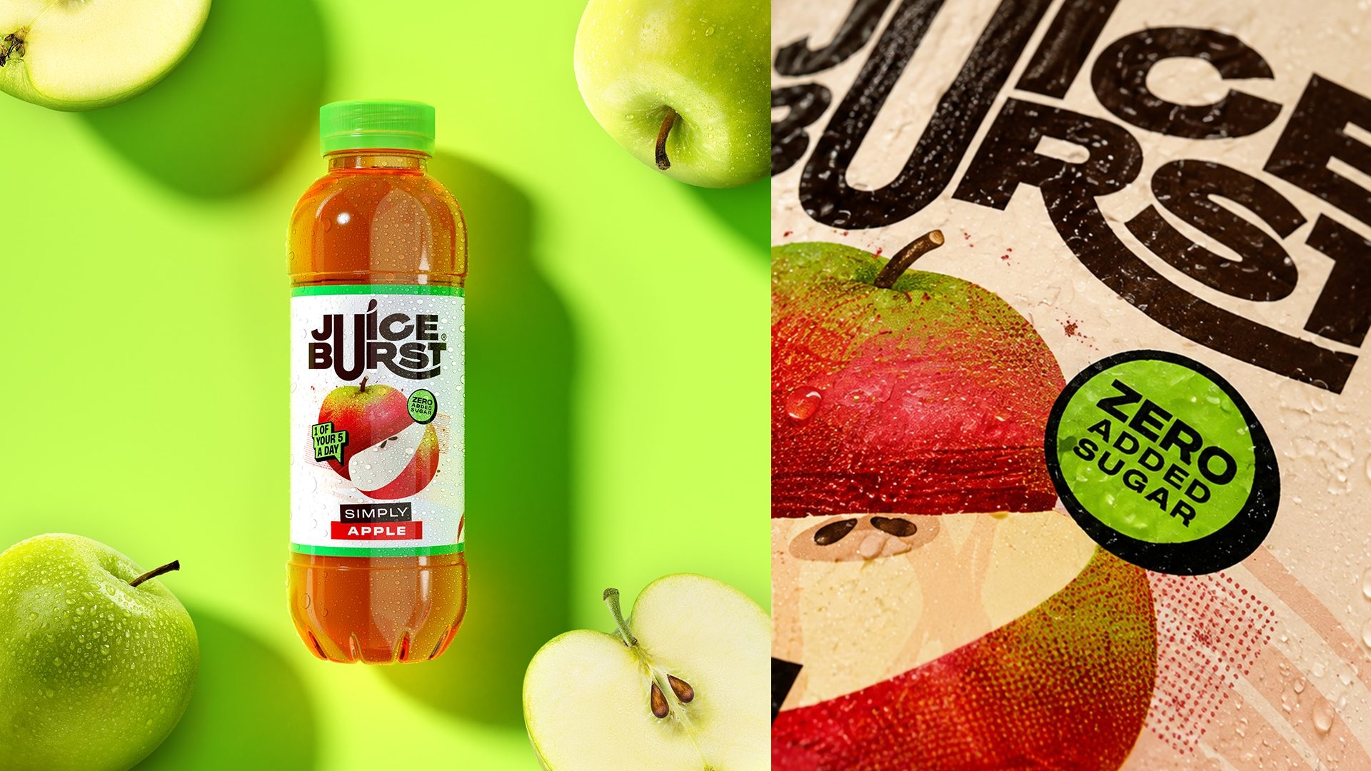
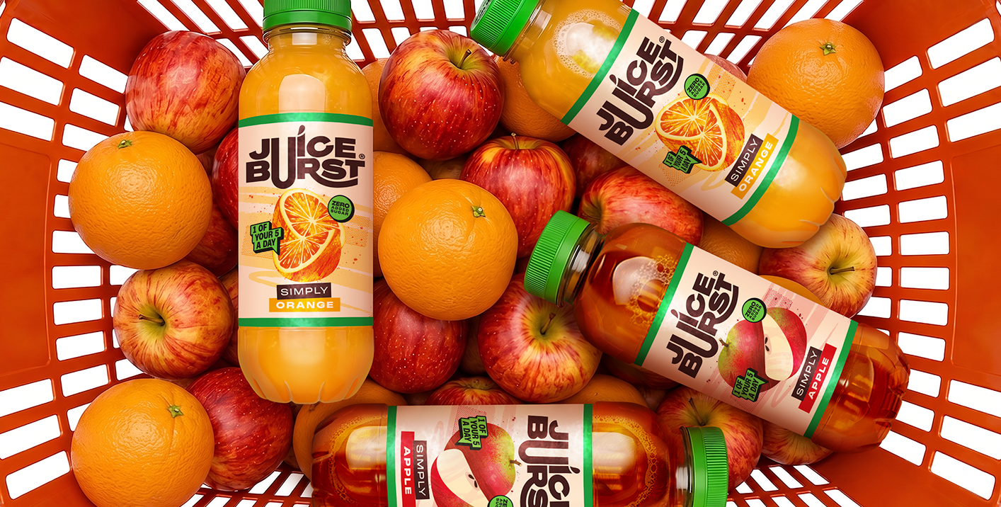
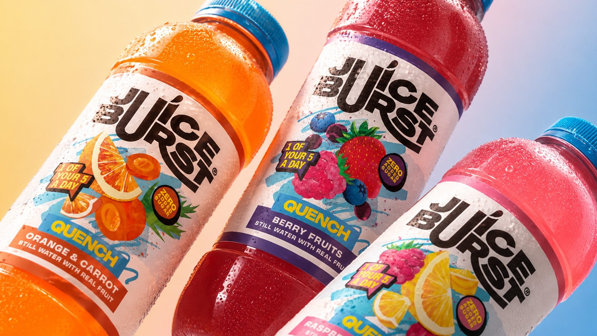
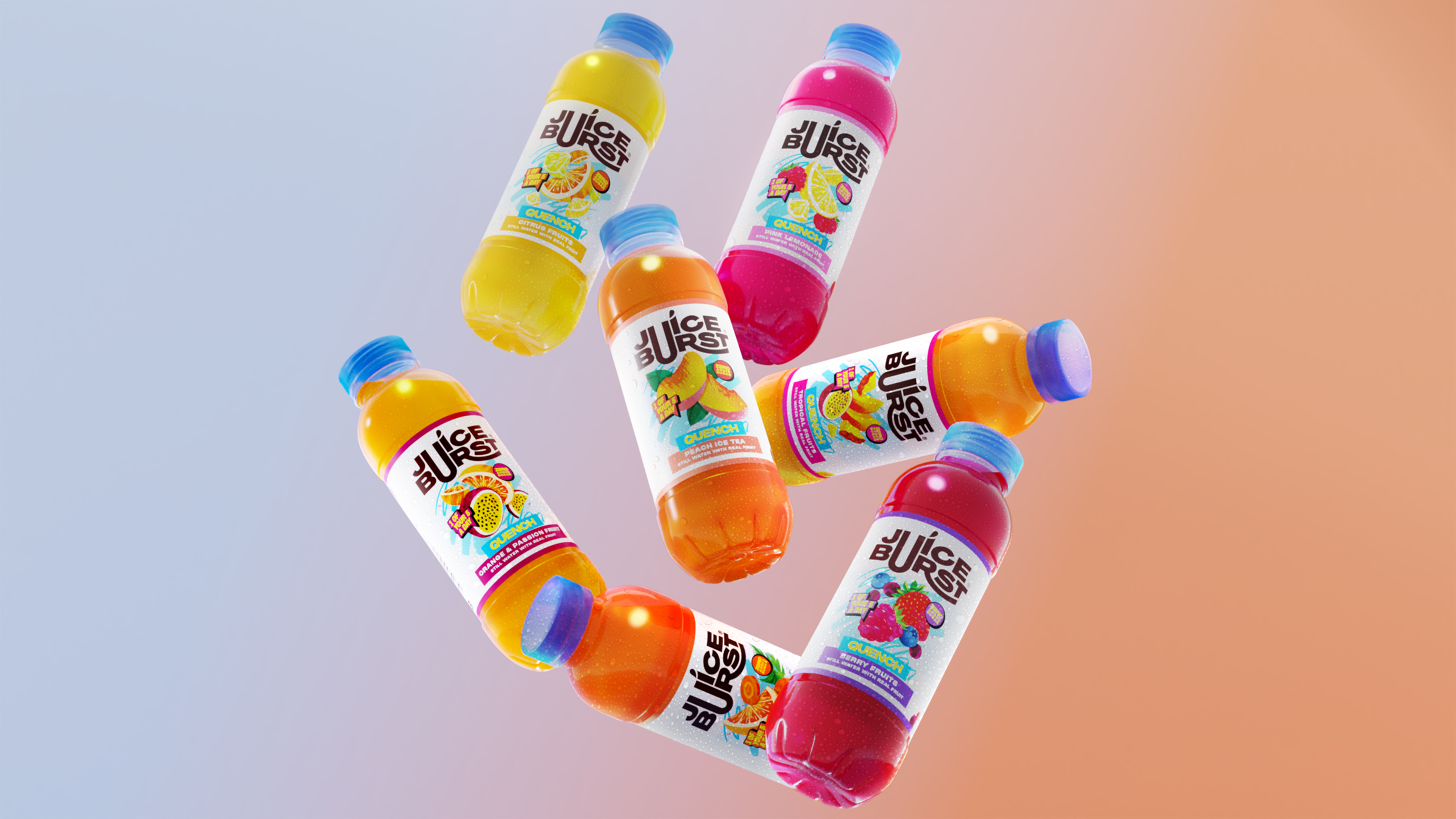
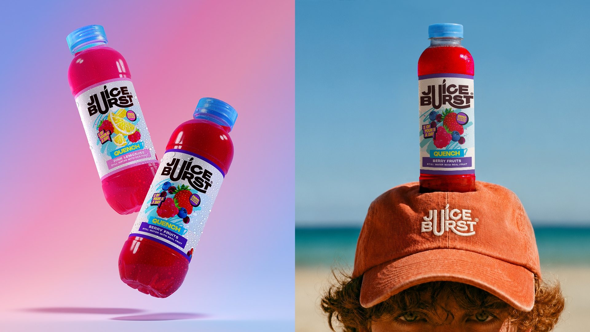
With a tight production deadline looming, packaging had to come first. So we developed and refined a scalable system that stayed fresh across 30 designs and three different ranges.
Each one had its own flavour, but together they were unmistakably Juice Burst.
From a bottle to a brand world full of flavour
You can only fit so much on a bottle.
So we took the new identity beyond the fridge.
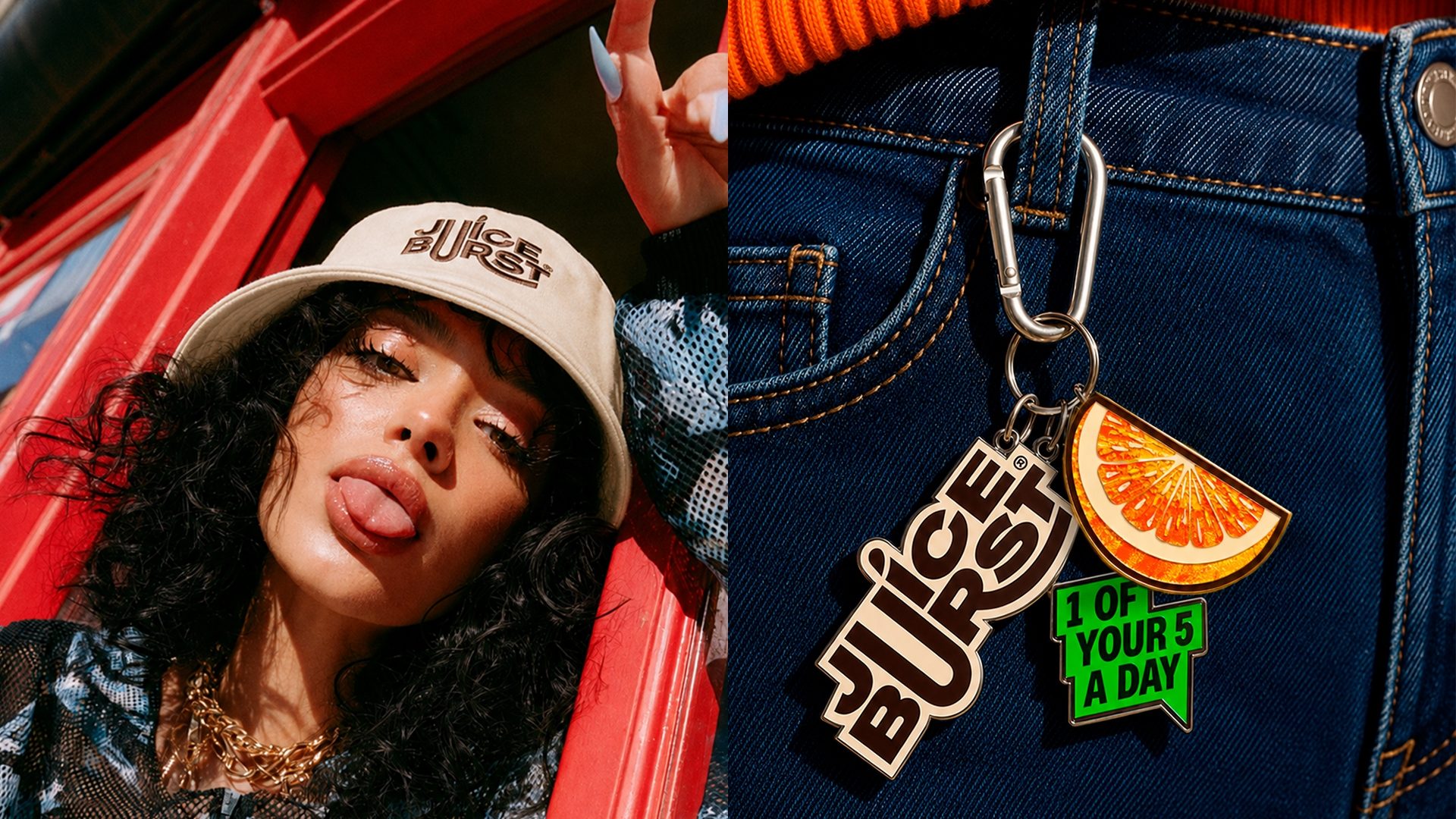
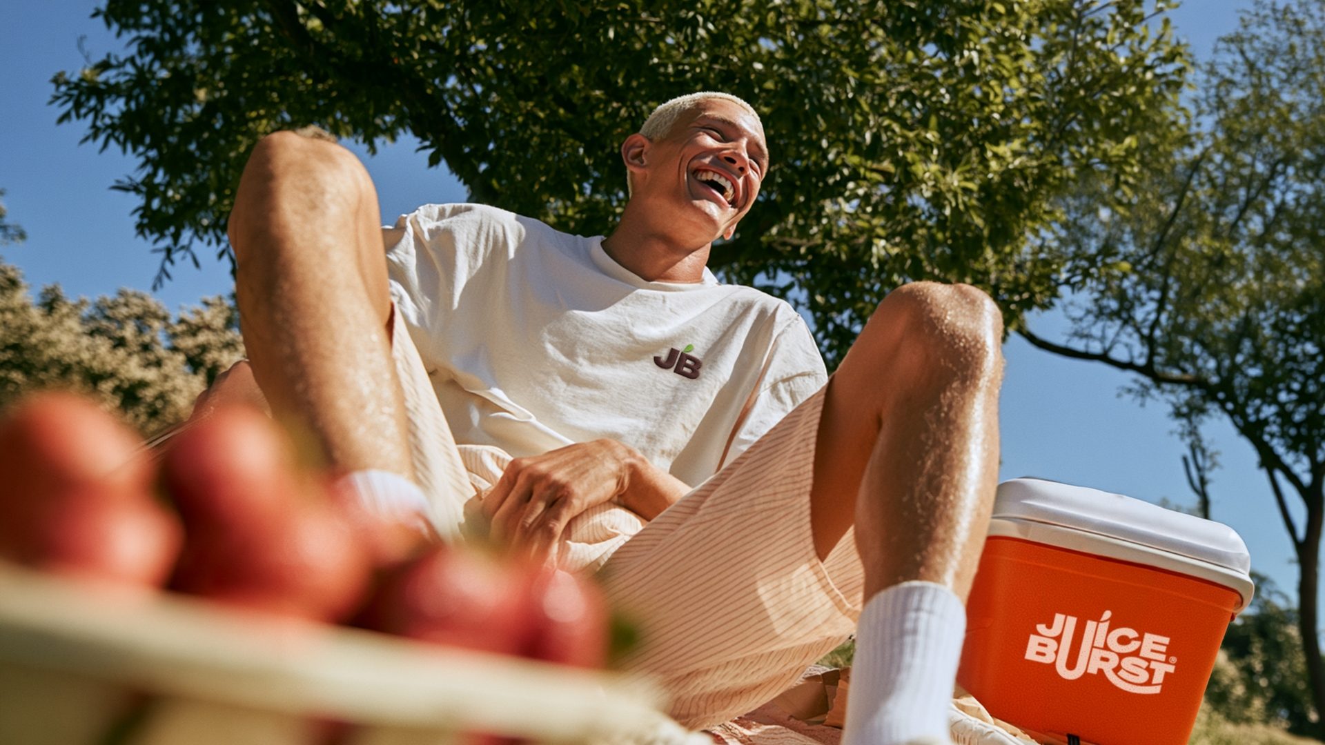
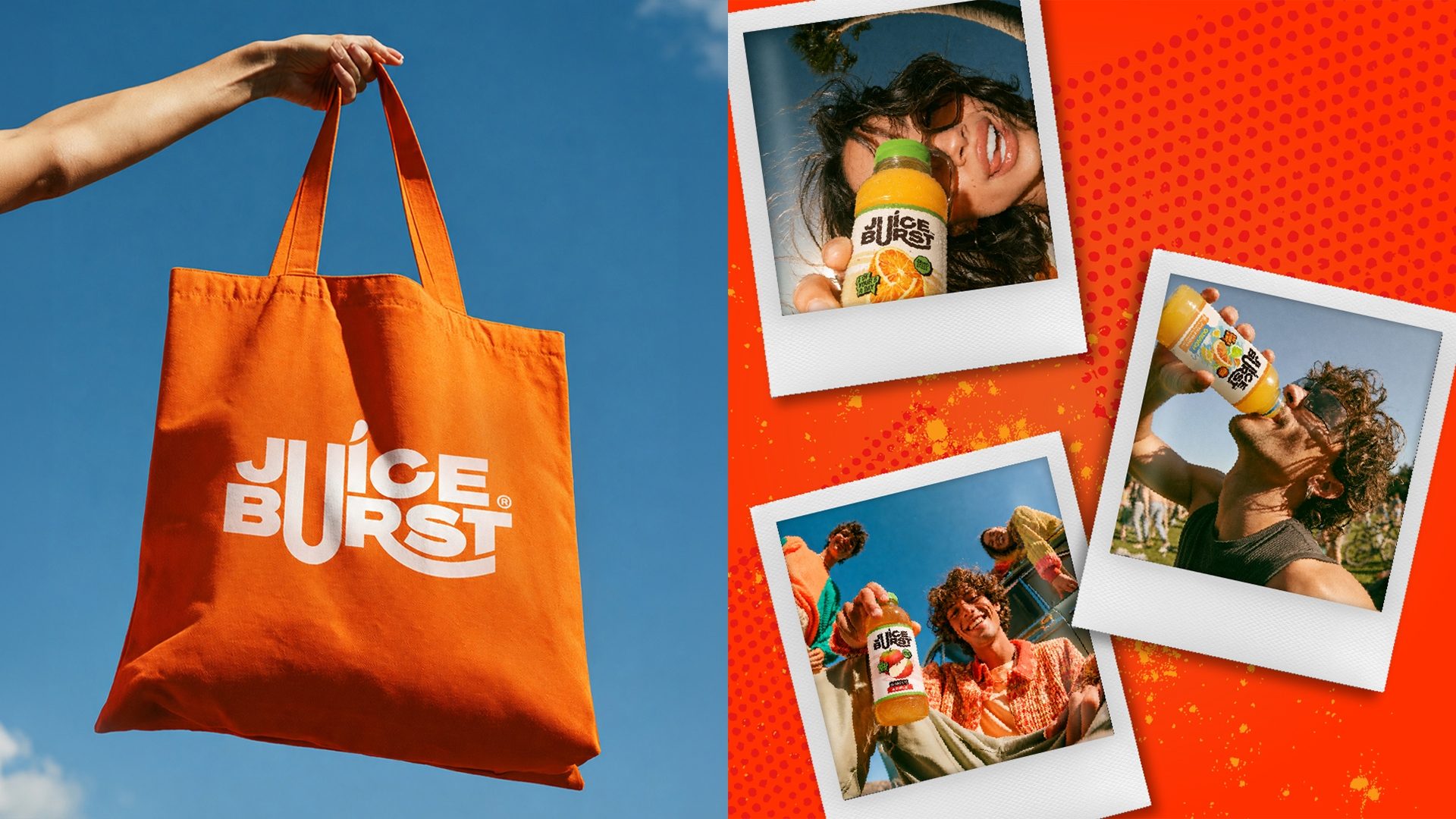
We built out the world of Juice Burst and The Juice Burst Drinks Co., covering everything from uniforms and merchandise to marketing collateral, gifting and internal communications that got everyone excited again about the brand.
Then we kept going.
Website. HQ branding. Festival activations. Internal launch events.
All designed to make sure Juice Burst looked, felt and behaved like the same brand wherever it showed up.
From something people drank without thinking about the name, to a brand built to be recognised.
And remembered.