Strengthening digital experiences, physically
There’s a fair amount of bad news at the moment so if you want a tale of choice digital marketing to distract you from that, here you go.
It was that time when my old glasses had become too scratched to see out of and I wanted to update the frames. I had a little look around but not being in a huge rush for them I was idling and looking through the ‘gram for exciting new menswear (everyone’s got to stay busy right?) and I clicked on a post where the person was wearing glasses which were nice. This turned out to be an influencer post for Bloobloom. They were nice frames so I clicked through to their profile just to get an idea of price and to see if they had any other nice frames. I know that there is plenty already written down about the importance of having a cohesive profile but to hammer the point home, this was the first step of my journey as a customer and I’ve already had my two questions answered by the bio and the feed (the tonality atm is choice). I also found out from their profile that for every pair sold there is another pair donated and there’s a pay what you can for a second pair option. At this point I was almost sold.
So I clicked on their site on my mobile, “Try 5 frames at home, for 5 days, for free.” I have nothing to lose. I don’t have to do the weird online trying on of frames which doesn’t work well enough for me to commit, there’s no cost involved and whilst other companies offer this there aren’t thousands of frames to choose from so the offer is easier to navigate. I left it a day to dwell, then ordered the trial on my computer as I like to see things on a bigger screen before jumping in.
Making the first physical experience of the brand into a sensory experience stregthens the connection with the customer.
Now all this is fine. It’s good. For a digital experience it has worked really well and proves that a strong connection between influencer marketing, well curated social media presence, great mobile site experience, clear offers and a solid desktop site will make the customer journey exciting and as pain-free as possible. The styling is on point and provides the right notes of aspiration and elegance. I’ve also been told via email what my order is and when my order was dispatched so I can be in when the order arrives, which conveniently is in the middle of a drum and bass workout (shoutout to the excellent Fight Klub - you won’t find a more fun workout).

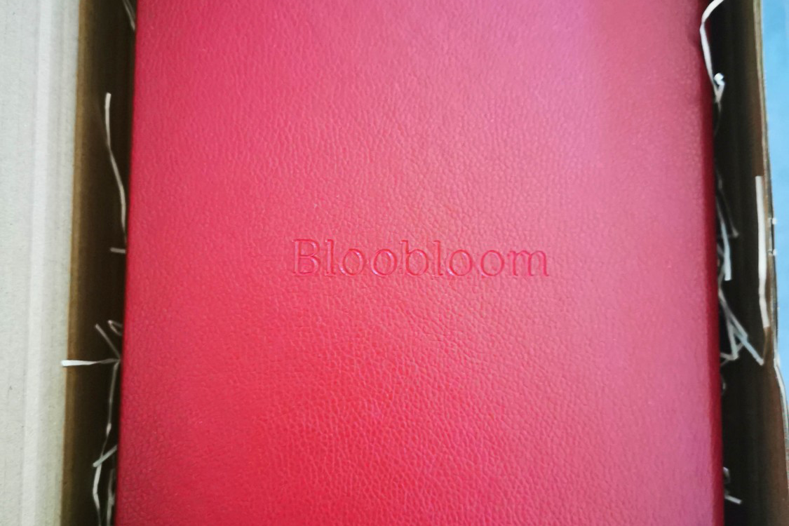
I was expecting a cardboard box with plenty of plastic. I was expecting to be excited with the glasses but that was it. An experience like any before. What I wasn’t expecting was to be made to feel special. A leather bound boxed debossed with the logo and name. A velvet touch blue interior letting me know that they’ve used vegan leather. A really nicely designed card covering the glasses again with the name as a useful brand reminder. The instructions on the reverse of the card (with the logo, just as another brand reminder) so I know exactly what to do with easy to access contact details. Finally the glasses themselves each separated by the blue velvet in their own channel. Oh man. This is lovely. I keep coming back to the box. The glasses are great and even the ones that don’t suit me are lovely. Touchpoints like this make a huge difference in the customer journey and make any consumer much more likely to become an advocate for a brand.

Susan Fournier highlighted the relationships we have with brands (If you haven’t read it and work with brands, read it immediately) which I explored in my research. Some respondents were happy to accept their brand love whilst others were more reticent to describe their feelings as love, despite being wholly devoted to a brand. However they responded though, their real world experience of the brand had more of an impact than their digital interactions. This is why this experience from a digitally native brand had such a big impact.

What Bloobloom provided was way over what I expected but it didn’t stop. I had an email to suggest I shared the options with friends on social to help me pick which I have done, getting recommendations from friends. This will obviously open future conversations for them to ask me which brand I used when picking my glasses allowing for more free advocacy. I was also offered the opportunity to “Share your snaps using @bloobloomlive on social media and we’ll give you honest feedback in a flash.” or email them directly if I didn’t want to do it on social. I know there are great opticians out there but the price, convenience and experience of this has elevated the brand as a whole to something else for me, to the point at which I’ve written over 500 words about it. This is a great exemplification of the RACE model and now I’ve become a brand advocate because of a box.
It isn’t just the box. Despite the unusual name, I’m now invested in this brand and I’m sure I’ll use them again. Don’t forget this a product that I am only likely to buy every year or two and to stand out using the techniques the brand have used, providing a seamless digital experience alongside an memorable real world experience, is an example every brand should strive for. Hats off to you Bloobloom.


